Most traders react to price. The edge is in the data underneath it — breadth, participation, institutional flows, and a single composite read that ties it all together. NiveshAstra puts it on one screen, updated every trading day.
Most traders watch the chart and miss the market data underneath it. These indicators live across a dozen scattered sources, in formats few have time to read. NiveshAstra collapses all of it into one daily routine: open the dashboard, read the market in two minutes, and act with context instead of guesswork.
The Market Score distils dozens of breadth, momentum and participation indicators into a single number from 0–100 — so you read the market’s posture in seconds, not hours.
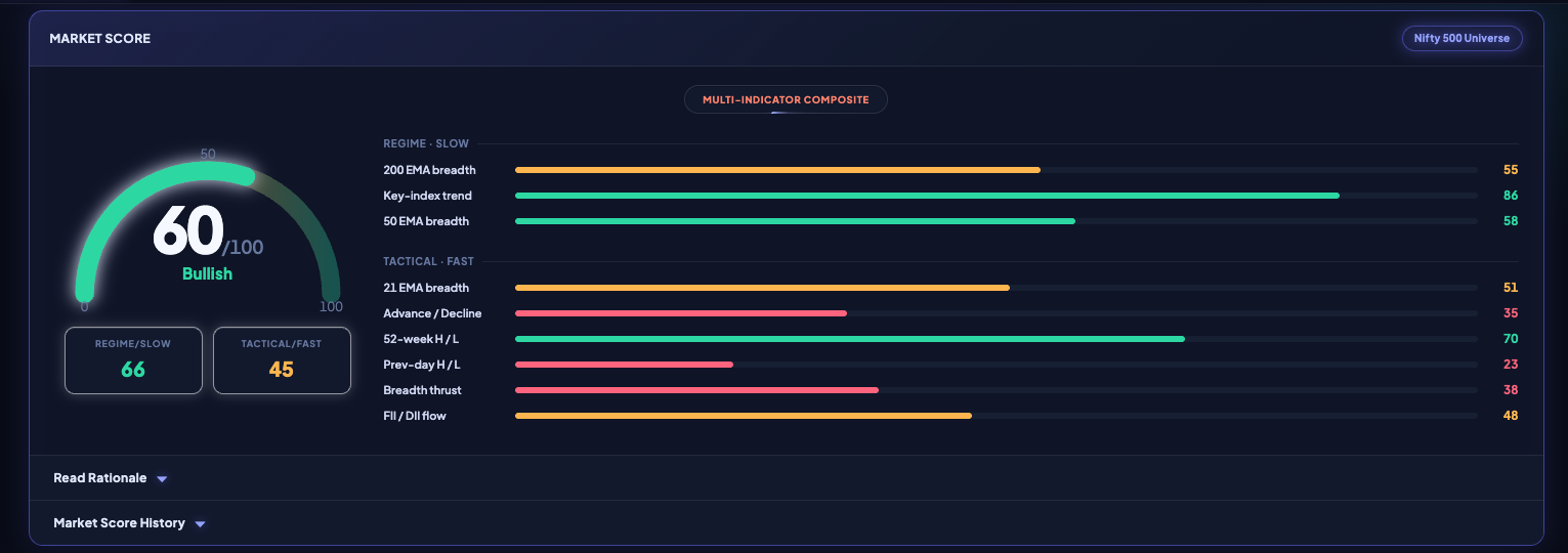
Nine breadth, momentum and flow indicators, weighted into a single 0–100 Market Score.
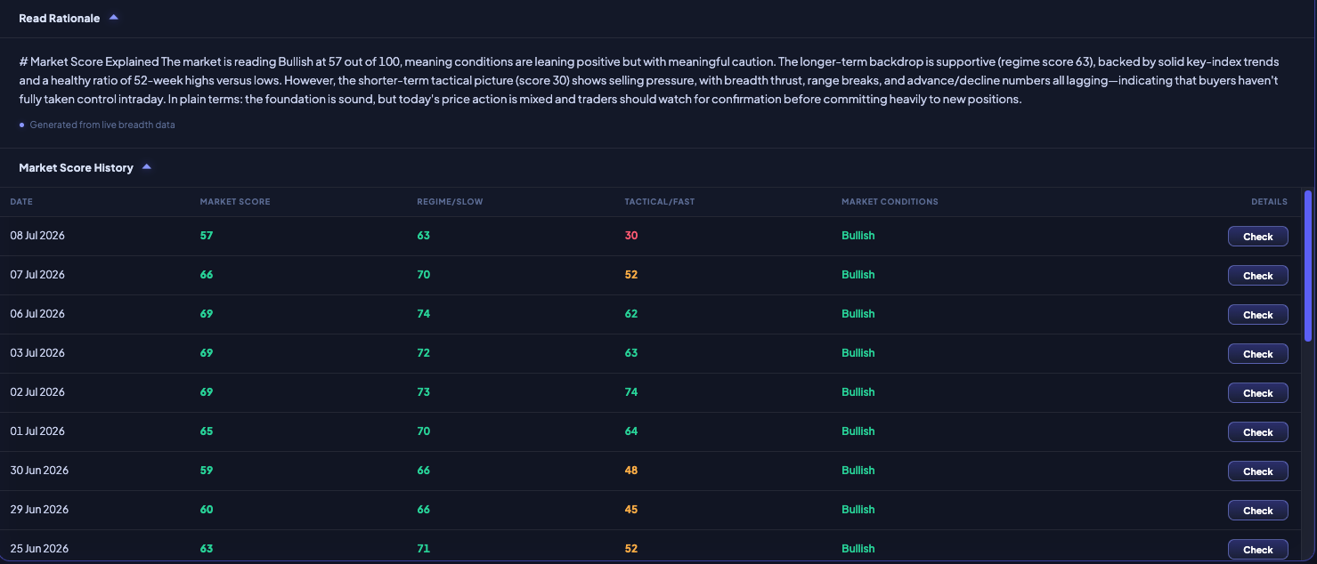
A plain-English rationale for today’s read — plus the full score history, day by day.
A concise written brief of what is actually moving — sectors, stocks and macro events — so you start the session informed instead of scrambling through headlines.
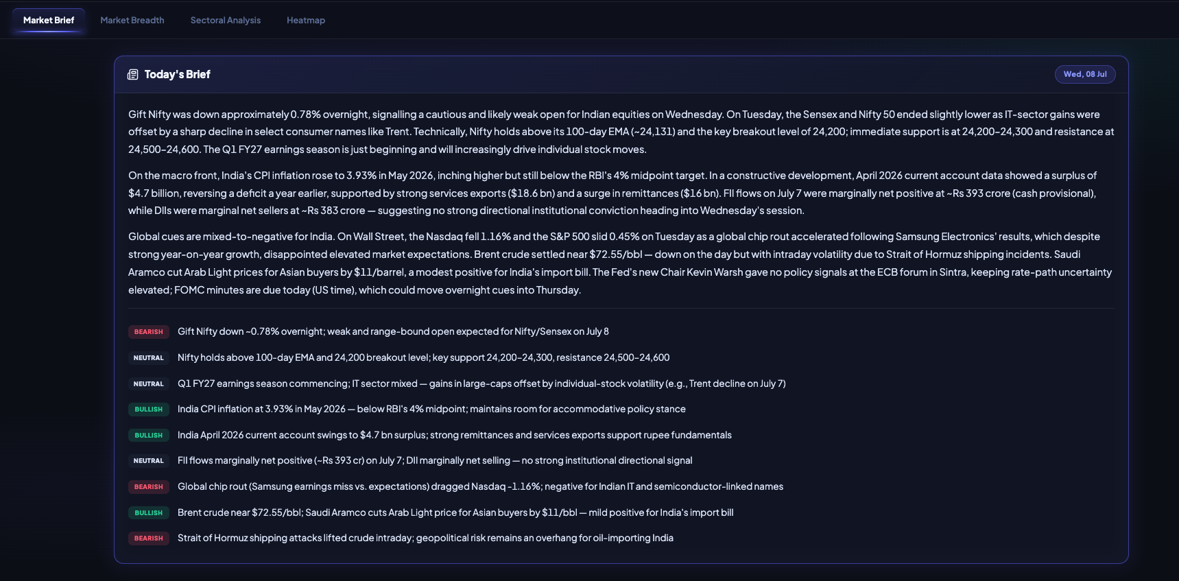
The full written brief, with every key development in context.
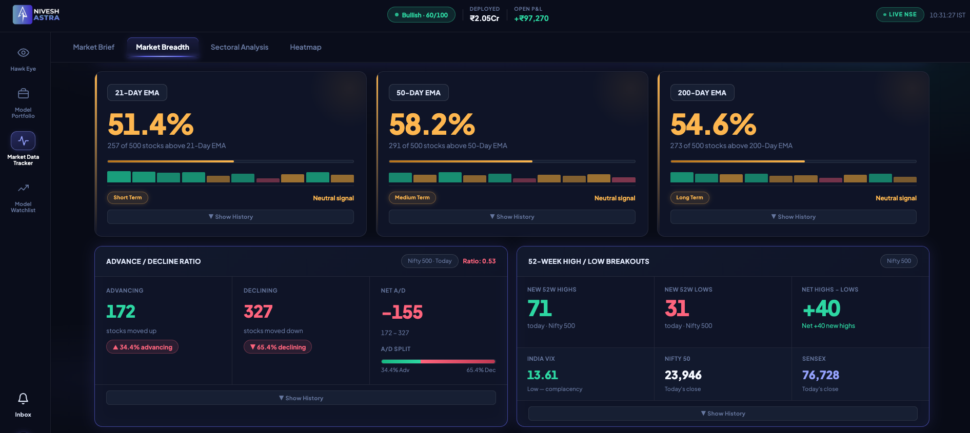
Price can rise while participation quietly thins. Breadth shows what the index hides — how many stocks are genuinely taking part.
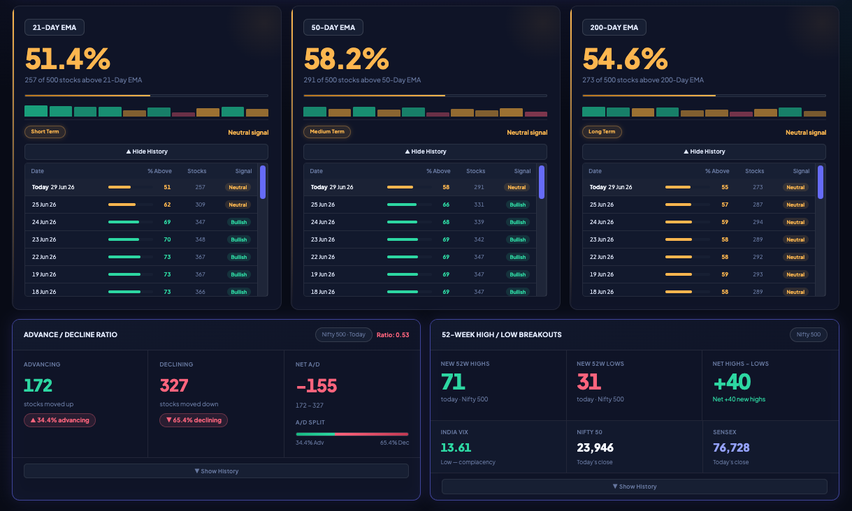
Participation across the 21 / 50 / 200-day EMAs, advance–decline, and 52-week highs vs lows.
Previous-day high/low breaks and the day’s biggest movers — fast internals that reveal thrust and exhaustion before the index catches up.
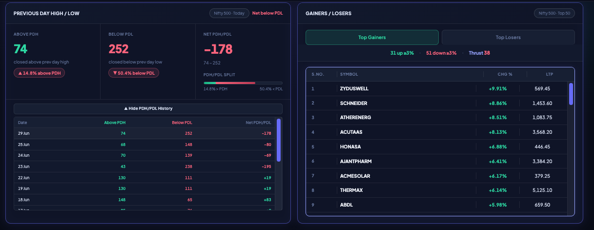
Previous-day high/low breaks and the day’s biggest movers — thrust and exhaustion at a glance.
Not just where the indices closed — but whether each sits above or below its key moving averages, across every timeframe.
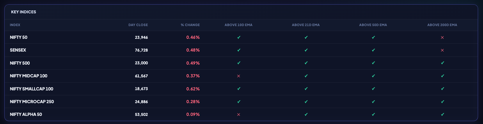
Every index with its close, % change, and whether it sits above each key moving average.
A Relative Rotation Graph maps every sector by momentum and strength, so you can see which sectors are leading, weakening, lagging, or improving — before it shows up on the index.
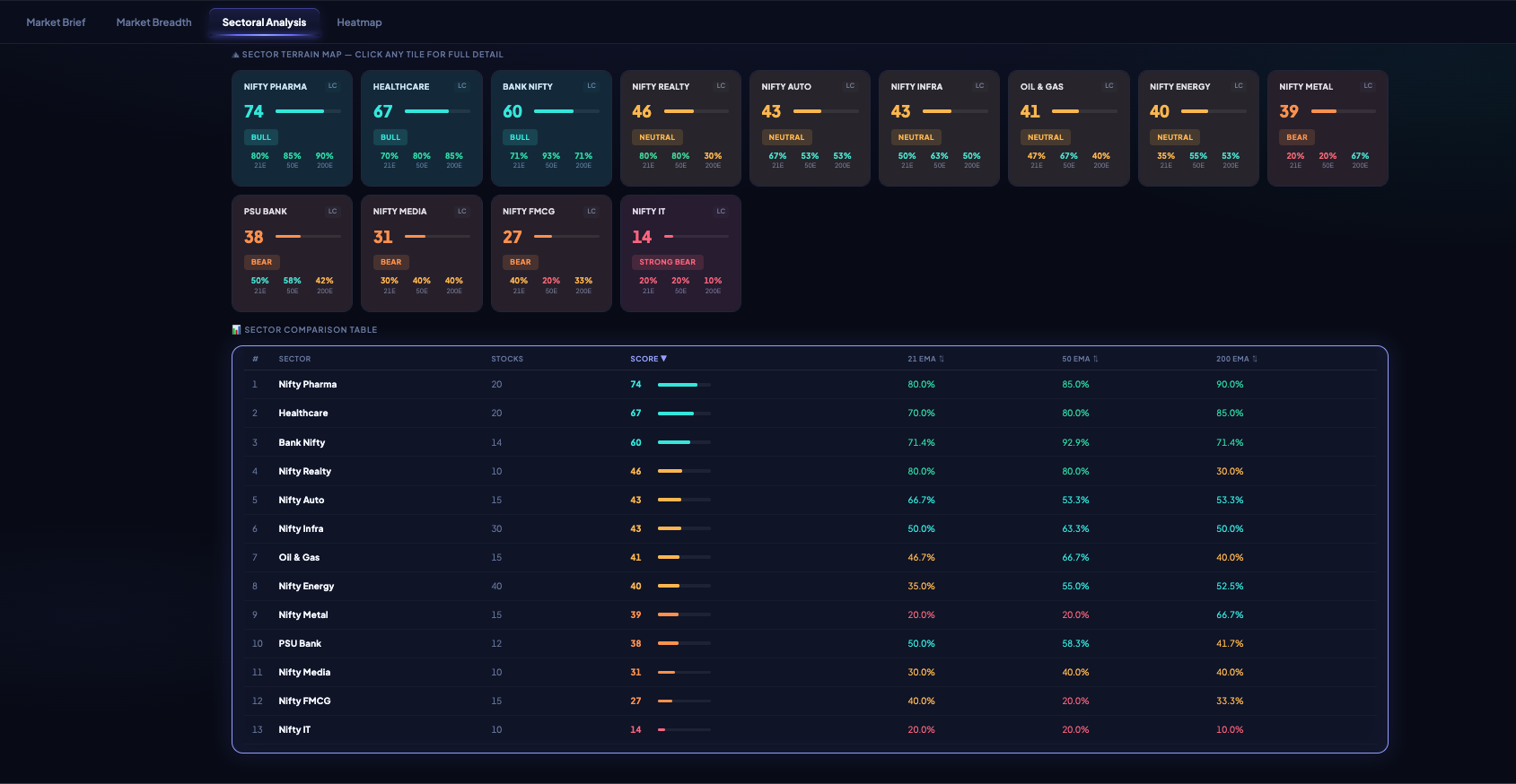
A Relative Rotation Graph — every sector plotted by strength and momentum across four rotation quadrants.
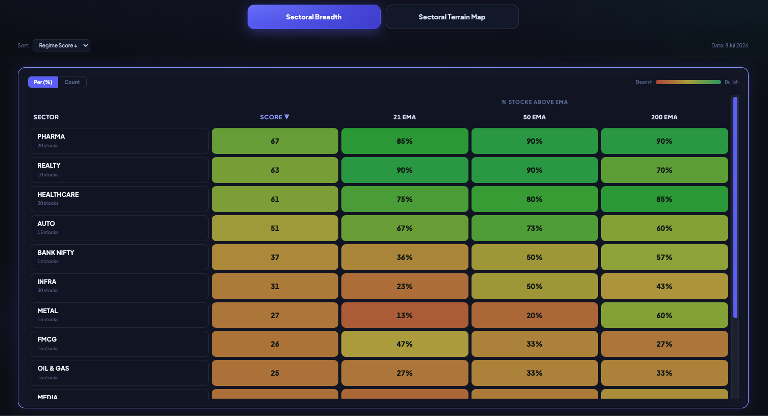
Sector breadth in a sortable table — the % of each sector’s stocks trading above their key EMAs.
Up to 500 stocks, sized and coloured by move and grouped by sector — the fastest way to see what is green, what is red and where the pressure sits.
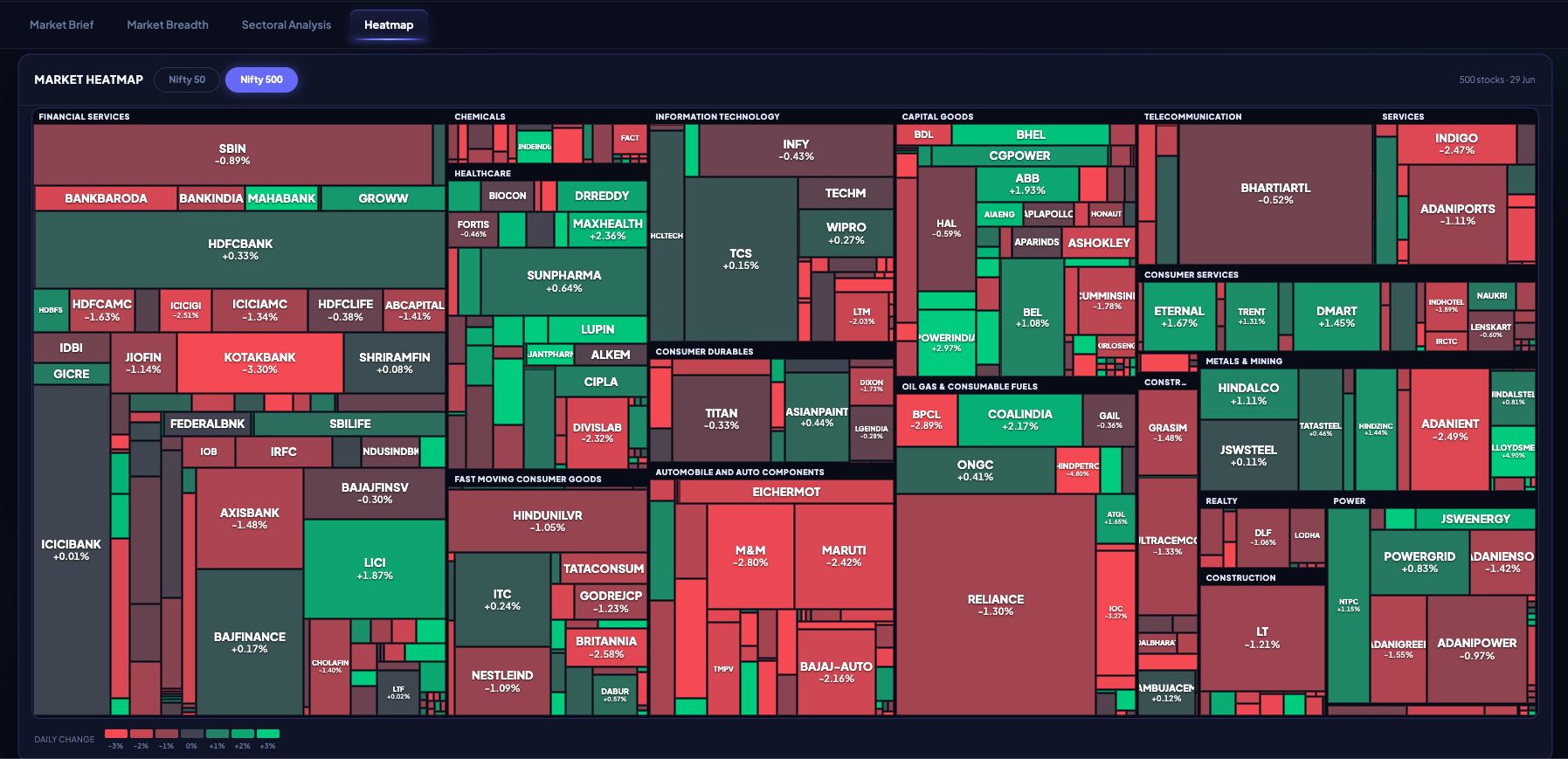
Up to 500 stocks, sized and coloured by move and grouped by sector — the whole market at a glance.
Daily FII and DII net activity — who is buying, who is selling, and what the tug-of-war means for the tape.
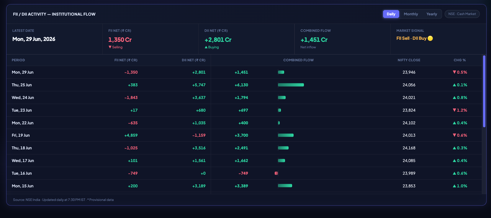
Daily FII and DII net activity, combined flow, and history against the Nifty close.
Market brief, breadth, score, sector rotation and institutional flows — your entire pre-market routine, on one screen, every trading day.
Get Started →